
In the iconic scene from 1939’s The Wizard of Oz when Dorothy opens the front door of her storm-swept homestead and discovers she’s not in Kansas anymore, we experience a masterclass in how cinematic color functions. Inside the house, and up to this point in the movie, we only see Dorothy’s world in monochrome — shades of sepia browns and yellows. It’s an antique, faded world – no wonder she longs for a place somewhere over the rainbow. Then, through the transitional wipe of an opening door, we are immersed into a world of Technicolor; saturation, bright reds, sparkling greens, deep blues, and yellow brick roads. The monumentality of this transition is reinforced by the film’s use of color. We have entered a world more real, more present, and perhaps even more dangerous, than our former reality.
There is an awesome power in moments like this, and you can use modern color grading techniques in your videos, commercials, and movies to impact your audiences in similar ways.
At the end of this article, we’ll give you a collection of the best free cinema LUTs. However, we first want to take you through some of the nuts and bolts of how cinema LUTs allow you to maximize the potential of your footage to tell a story or send a message. We’ll explore some keystones from movie history to inspire the best cinema LUTs, as well as give a basic overview of the technical process of color grading your next project.
Let’s dive in.
What Is A Cinema LUT?
Think of a LUT like an Instagram filter for video footage — it’s a preset that instantly makes your footage look a certain way. The presets are made by manipulating hue, saturation, and brightness in specific, coordinated ways.
Before we go any deeper, let’s go over some basic definitions:
LUT is an acronym for “lookup table”. In the context of color grading video footage, this refers to a set of data that a computer color grading program uses to take an input from your camera and transform it into the final footage of your choice. Basically, it’s a shortcut.
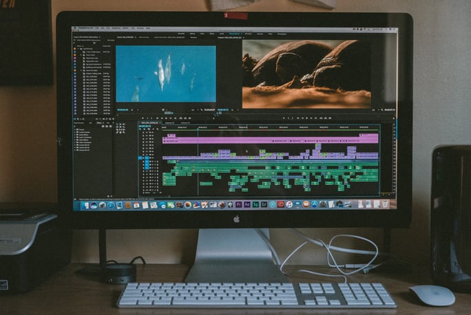
You’ll recognize a LUT as a file usually ending in a .CUBE extension. You can import LUTs into commercial color grading software like DaVinci Resolve, as well as non-linear editing applications like Adobe Premiere Pro and Apple Final Cut Pro.
Hue is color — red, orange, yellow, green, blue, purple, and everything in between.
Saturation is intensity — the deepness of a particular hue versus a faded version of that same color.
Brightness is lightness and darkness — it’s the amount of white or black in a particular color.
Next, let’s do a quick overview of the technical process of applying a cinema LUT to your footage.
Picture Profile: Why “Flat” Is Fresh
Believe it or not, choosing to record in the proper LOG or RAW picture profile setting on your camera before you shoot your footage is the single most important step in color grading.
As a useful analogy, consider the philosophy of the world renowned chef Alice Waters, famous for her advocacy of organic, locally grown ingredients. When preparing to cook a meal, you must prioritize the freshness of the raw ingredients you source for your recipe. Freshness in this sense means the amount of flavor and nutrition packed inside every individual vegetable, fruit, nut, or bean. For Waters, this is the most important consideration when cooking because it affects every step that comes after it. You wouldn’t want to cook a fresh meal by starting with Spam (apologies to the readers from Hawai’i).
In the same way, you must prioritize the “freshness” of your footage. This means shooting with the settings that will record the maximum possible amount of information. This decision is baked-in from the start, so it must be respected.
RAW footage is great because it’s uncompressed, but you can achieve close to the same thing with log footage, without spending your whole budget on data storage. Log footage will record at a high bit depth — information — and preserve dynamic range — details in the shadows and highlights. Depending on the camera this might be referred to as S-Log (Sony), C-Log (Canon), Log C (Arri), REDlogFilm (RED), BMD Film (Blackmagic), Protune (GoPro), or similar.
You might notice that log footage can look flat and boring when you review it out of the camera, but don’t be worried. “Flat” is fresh.
Color Correction
The next step is color correction. Note this is not the same as color grading — that’s the next and final stage. Instead, we are preparing your footage for grading by making it “correct”. The goal at this point is accuracy and consistency — getting real-world colors out of your footage by converting log footage to your target space (such as Rec. 709, today’s accepted standard for most delivery platforms), adjusting black and white levels, exposure, contrast, and the white balance. There are even special “input LUTs” that do much of this work for you, though you should note that these are not the same as cinema LUTs.
After color correction you’re ready to grade your footage. Color grading is the artist’s intent. It’s when you flavor the final footage and create the look that your audience will experience.
Now, it’s finally time to apply our cinema LUTs.
Color and Emotion
Colors are, fundamentally, a phenomenon of physics, but our experience of color is psychological. Consider Pixar’s Inside Out, in which five color-coded characters control the young hero’s behavior. Sadness is blue, Fear is purple, Disgust is green, Anger is red, and the troublemaking Joy is yellow. But why are the emotions these respective colors? If there’s something innately disgusting about green, why do we feel serene when surrounded by a lush grassy garden? Is yellow really joyful, or can it just as easily represent sickliness? Red is both anger and the way we think of a loving valentine.
Apocalypse Now cinematographer Vittorio Storaro, drawing from Goethe’s Theory of Color, considered the emotional and symbolic nature of cinematic color. Red is vital, bloody, the past. Green is nature, placid, and protecting. Blue is thoughtful and gentle, the future. But these definitions are never constant. They change from individual to individual, from time to time, and from culture to culture. The ephemeral nature of color is the source of much of its power to visual storytellers, who can harness its fluidity to create new symbolic meaning in their works.
Fantasy
Think back to The Wizard of Oz. The Technicolor look of MGM musicals from the Golden Age of Hollywood are not just bright and saturated. These colors are so bright they pop. It conveys spectacle and fantasy. The effect on the audience is excitement and the feeling of being immersed in a hyperreality.
Natural Realism
In Terrence Malick’s The Tree of Life, cinematographer Emmanuel Lubeski’s impressionistic realism heightens the intensity of the film’s human feeling. Vibrant colors, naïve colors, inspired by nature, are not only innocent, but alive and rapturous. Consider also the opening scene of Silent Light by Carlos Reygadas. The slow reveal of blue, then orange, then red in the sky as sunrise awakens the world of the film’s Northern Mexican Mennonite community is among the most transcendental moments in all of cinema.
Sickliness
Forget the lush greens of nature. David Fincher — in thrillers like Seven, Fight Club, and The Social Network — uses muted, desaturated blues, yellows, and especially greens to create edgy, menacing, sickly environments for his serial killers and sociopaths. This effect is also at work in dystopian movies like The Matrix — something isn’t quite right with this world.
Myth
Oh Brother, Where Art Thou? from 2000 was the first film in history to be digitally color graded. The desaturated effect of the sepia tone — faded, vintage, almost monochromatic, creates a sense of age, distance, and also myth. Saving Private Ryan — a very different film — uses desaturation for much the same effect, this time to create a modern myth by association with the faded, framed photographs of America’s World War veterans.
Vitality
Consider the iconic red curtain present in several of David Lynch’s works like Blue Velvet, Twin Peaks, and Mulholland Drive. In the world of Lynch’s nightmare-scapes, this color means something very powerful, transporting yet ominous, even life-threatening. But in the works of Wong Kar Wai (In the Mood for Love) and Pedro Almodóvar (Talk to Her), reds, as well as oranges and yellows, become sensual, life-affirming, and warmly erotic colors.
Noir
High contrast imagery and desaturated colors are the hallmarks of classic film noir (The Maltese Falcon, Double Indemnity) and its descendent neo-noir (Blade Runner, No Country for Old Men). In the words of scholar Nicholas Christopher, “Every film noir is the shadowland of a lost paradise, a fallen state.” The effect of these deep, engulfing shadows is hopelessness, a sense of foreboding, defeat, and despair.
Action and Dreams
Contrasting hues are powerful because they make subjects pop. The cold blue backgrounds in a film like Eyes Wide Shut — saturated and dreamlike — highlight the warm yellow characters and vice versa. This effective dynamic, typically using teal and orange, is prevalent in many modern Hollywood creations such as Transformers and Tron: Legacy, but there’s perhaps no better example than 2015’s explosive Mad Max: Fury Road.
Prestige
Until the 1970s, most “serious” dramatic films were deemed too important to be filmed in color — think Elia Kazan’s On the Waterfront and Ingmar Bergman’s Persona. You can see this legacy even in modern times in “prestige” films like 2018’s Cold War and Roma. Gordon Willis, Sven Nykvist and other masters of classic black and white cinematography used rich tones instead of color to create elegant and textured worlds, even in monochrome.
Best Cinema LUTs
I hope this article has deepened your understanding of and appreciation for how you can use color in cinematic ways to affect your audience.
Assemble has (ahem) assembled some of the best cinema LUTs below, inspired by the examples above for you to download and use when color grading your next project:
- Color Grading Central (variety): https://www.colorgradingcentral.com/free-luts/
- Frank Glencairn’s K-Tone LUT (vintage): https://frankglencairn.wordpress.com/2014/01/15/everything-looks-better-on-kodachrome-k-tone-lut/
- Ground Control Color (variety): https://groundcontrolcolor.com/collections/free-color-grading-luts/products/free-canon-cinestyle-to-rec-709-lut
- SmallHD (with movie examples): https://smallhd.com/blogs/community/movie-looks-downloadRocketstock (by Shutterstock): https://www.rocketstock.com/free-after-effects-templates/35-free-luts-for-color-grading-videos/
Color, like cinema itself, is a kind of magic. It creates meaning and impact through an alchemy of technology, psychology, and your creativity. Always remember, the meaning of colors are never fixed, and therein lies an incredible and evergreen opportunity for innovation. I hope that using these cinema LUTs inspires you to further experiment with exciting new ways to tell your stories.
Enjoy, and happy grading!